Coforge Brand Identity

From NIIT Technologies to Coforge — building a brand new identity from the ground up.

Challenges & Objectives

/ Project Overview

When NIIT Technologies rebranded as Coforge, it was never just a name change. It was a full identity reset — a signal to the market that the organization had fundamentally evolved. The new name itself carries the idea of co-creation and collaboration. “Co” meaning together, “forge” meaning to shape, build, and strengthen. The brand had to reflect exactly that: two forces coming together to create something lasting.


The task was to design a complete visual identity from scratch. A new logo. A new color story. A new typographic voice. Everything built to represent a globally operating IT company with confidence, clarity, and real purpose.

/ Challenges

Rebranding a publicly listed company is never a cosmetic exercise. The transition from NIIT Technologies to Coforge meant retiring a name that had decades of equity, stakeholder recognition, and market presence. The visual identity had to carry that legacy forward while signaling a bold new direction.


An external agency had been engaged first and presented multiple logo directions. None of them captured the core idea: the spirit of working together, of two forces converging. The options felt safe, but they did not tell the story. The CMO recognized the gap and turned to the internal design team to take ownership of the brand.

/ Objectives

The goal was to create a simple, modern wordmark that communicated the essence of Coforge without relying on abstract symbols or complex iconography. The identity needed to work across digital and print, scale from a business card to a billboard, and feel distinctive enough to own in a competitive IT landscape. Most importantly, it had to make the meaning of the name visible — working together, two forces as one.

page_01
page_02
page_03
page_04
page_05
page_06
page_07
page_08
page_09
page_10
page_11
page_12
page_13
page_14

Creative
process

Working closely with my manager Gowtham, we started from the name itself. “Coforge” is made up of two ideas and we wanted that duality to live inside the logo, not just the name.


We chose a wordmark approach because the name was new to the market and needed maximum visibility without distraction. The typeface needed to feel approachable yet authoritative — warm, not cold; modern, not trendy.


The key design decision was in the letter O. We designed the O as a two-part magnetic form — two arcs facing each other, almost touching, held together by an invisible force. It is a subtle but deliberate visual metaphor for co-forces, two entities drawn together to create something stronger. The dual color split across the “C” and the wordmark — Coforge Blue and Coforge Orange — reinforced the same idea: two distinct energies, one unified identity.


Blue was chosen to represent trust, dependability, and the strength Coforge brings to long-term client relationships. Orange communicates confidence, warmth, energy, and the ability to drive transformation. Together, they define what Coforge stands for both inside and outside.


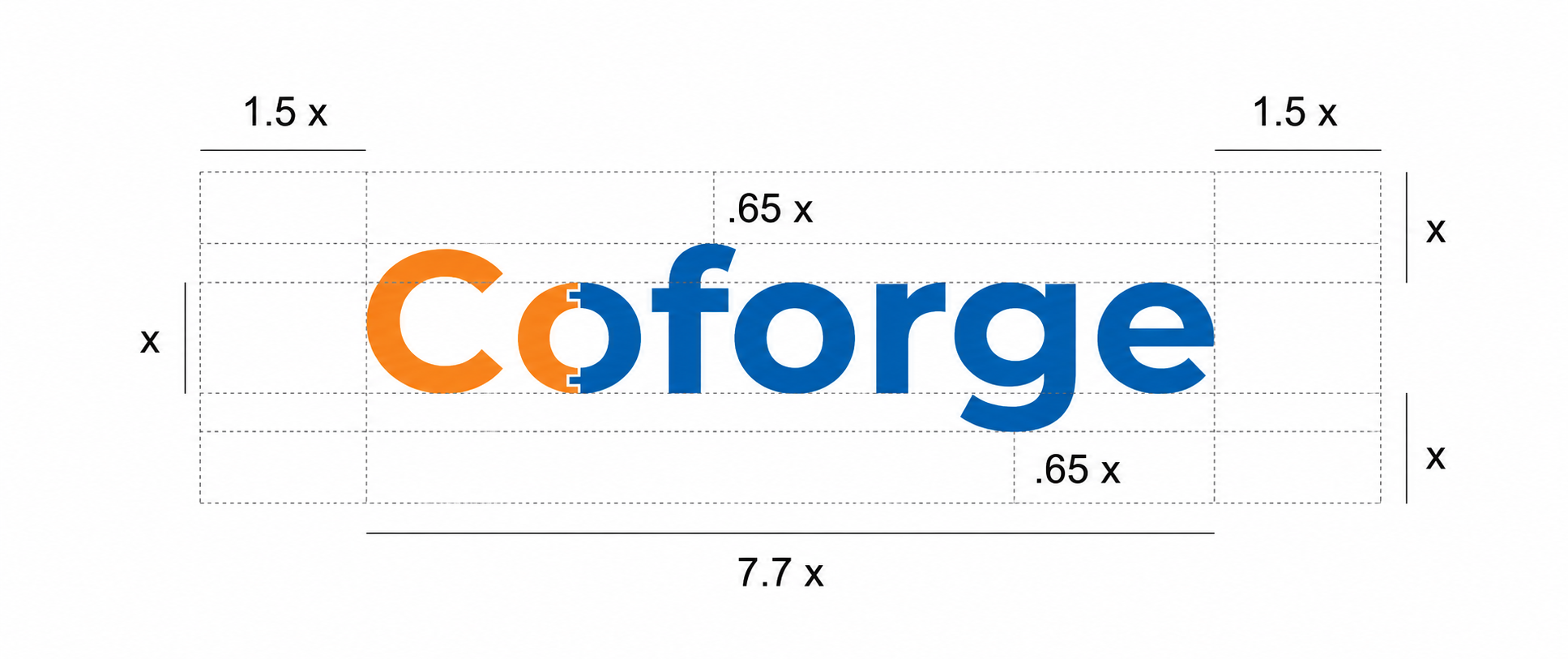
The final identity was built into a comprehensive brand guidelines system covering logo usage, clear space rules, color palette, typography (Arial as primary, Helvetica as secondary), and correct and incorrect usage scenarios — giving every team, agency, and partner the tools to express the brand consistently at every touchpoint.