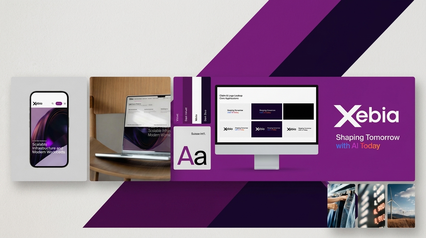
/ Project Overview
Xebia needed a cohesive master brand that could scale across global markets, multiple service lines, and diverse digital touchpoints — from web and social to events and partner co-branding.
/ Challenges
Creating a brand flexible enough to work across 10+ service lines and partner ecosystems.
Maintaining visual consistency while allowing expressive, platform-specific adaptations.
Unifying a previously fragmented identity under one bold, recognizable system.
/ Objectives
Build a scalable design system with centralized color tokens, typography, and component libraries.
Define a visual language that is Unified, Flexible, Intuitive, and Engaging.
Establish clear logo, claim, and imagery guidelines for all internal and external communications.