Earlier Brand Guidelines

The first-ever brand guidelines for Xebia — a global tech consultancy — built from scratch to unify identity across social media, website, motion graphics, and all digital touchpoints.

Challenges & Objectives

/ Project Overview

These were the first brand guidelines ever created for Xebia. As a fast-growing global IT consultancy with teams across multiple countries, Xebia had no unified visual system. Everything — social media, website, presentations, motion graphics — was being created inconsistently. The challenge was to build a brand identity from zero that could work across all formats, all teams, and all regions simultaneously.

/ Challenges

Creating Xebia’s first-ever brand guidelines from the ground up — no visual heritage to build on. Designing a system flexible enough to scale across social media, web, motion graphics, events, and print — all at once.

The core creative challenge: the brand needed to feel fluid and dynamic, not rigid. So we chose organic shapes — flowing blobs and wavy lines — as the signature visual language. Making those fluid shapes systematic and rule-based without losing their energy was the hardest design problem to solve.

Achieving brand recognition globally with a single, consistent purple — Tranquil Velvet (#6C1D5F) — across teams that had never worked from a shared visual system before.
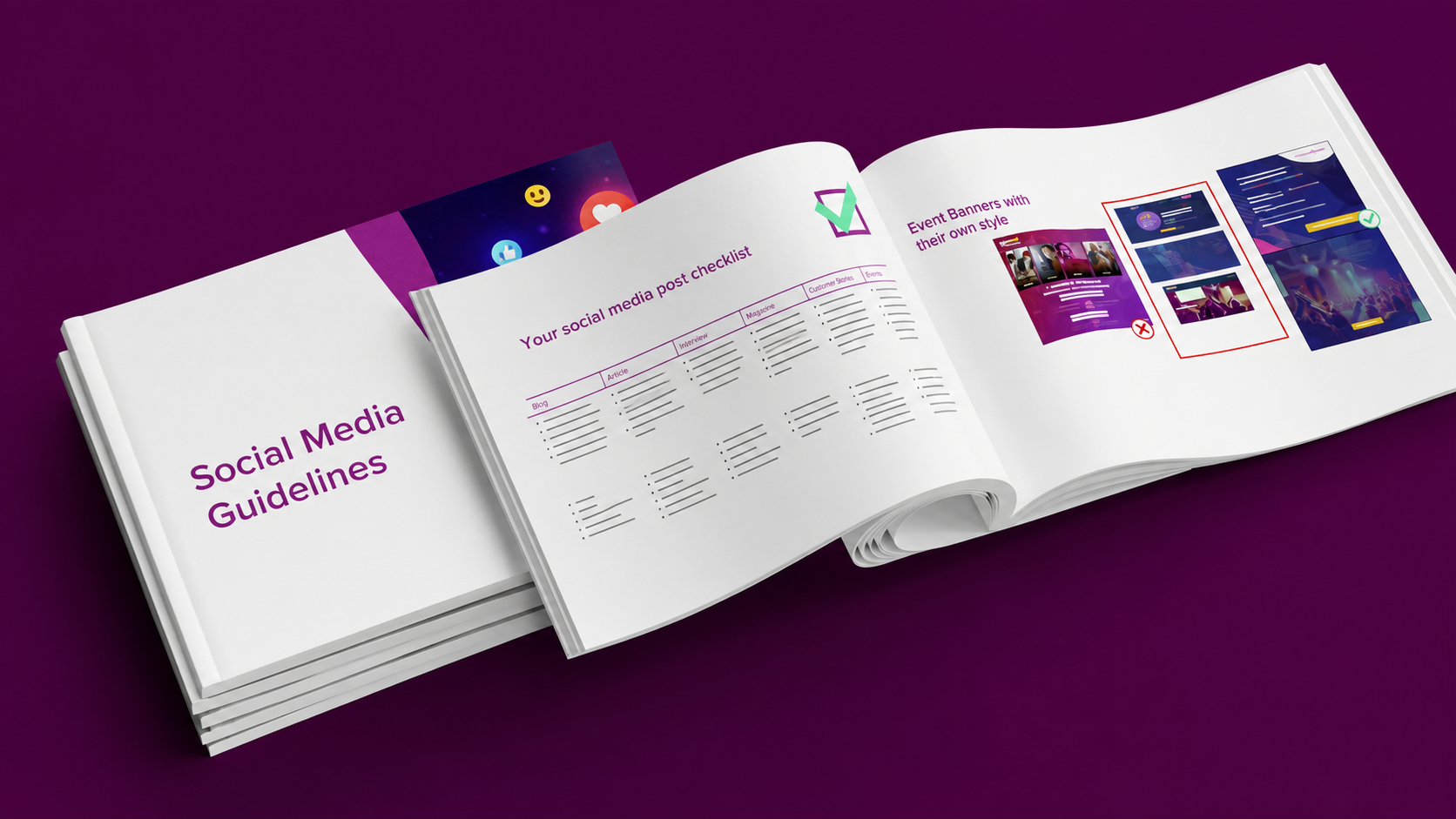
/ Objectives

Define a complete, ready-to-use brand system covering logo usage, color palette, typography, organic shapes, iconography, imagery, and button styles.

Establish the “blob” design language — organic, asymmetric shapes that express Xebia’s flexibility and human-centered approach.

Build a system simple enough for non-designers to use correctly, with clear do’s and don’ts for every element.

Deliver all assets directly in Figma so the entire global team could access and apply them immediately.
page_01
page_05
page_06
page_10
page_13
page_17
page_18
page_30
page_28
page_33

Creative
process

The entire system was built around one guiding idea: a brand is only powerful when someone can recognize it within a second. Every decision — from color to shape to type — was made in service of that recognition. We worked in phases, from brand philosophy to practical application, ensuring the system was both visually distinctive and operationally usable by teams across the globe.


Four steps:

  • Brand Foundation — Defined Xebia’s identity as an authority, a digital expert, and a pioneer. The brand voice was established around consistency, trust, and ambition. The tagline “Creating Digital Leaders.” became the anchor for all communication.
  • Color & Identity — Built the primary palette around Tranquil Velvet (#6C1D5F) — Xebia’s signature purple, equivalent in recognition to “Coca-Cola red.” Secondary palettes (Dawn, Dusk, and neutral grays) were added for depth. CTA colors — orange and teal — were defined specifically for interactive elements.
  • The Fluid Shape System — Chose organic “blob” shapes as the core visual element to express Xebia’s dynamic, people-first character. Designed rules for stacking (max 3 shapes), color usage, outline variants, and wavy dividers. All blobs were made available in Figma Assets for team-wide access.”
  • Typography, Iconography & Application — Standardised Arial across all brand materials with a strict type hierarchy (H1 through footnotes). Documented icon sets for all service lines and industries. Defined imagery rules for stock, own photography, device mockups, and the Xebia office graffiti art. Built social media and web examples to show the system in action.