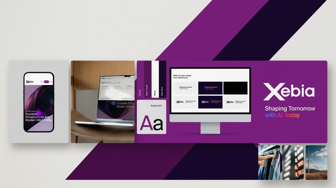
Xebia Brand Identity
We built a unified master brand visual identity for Xebia — a global tech consultancy — spanning color systems, typography, logo lockups, imagery, and design principles across all digital and physical touchpoints.
Challenges & Objectives
/ Project Overview
Xebia needed a cohesive master brand that could scale across global markets, multiple service lines, and diverse digital touchpoints — from web and social to events and partner co-branding.
/ Challenges
Creating a brand flexible enough to work across 10+ service lines and partner ecosystems.
Maintaining visual consistency while allowing expressive, platform-specific adaptations.
Unifying a previously fragmented identity under one bold, recognizable system.
/ Objectives
Build a scalable design system with centralized color tokens, typography, and component libraries.
Define a visual language that is Unified, Flexible, Intuitive, and Engaging.
Establish clear logo, claim, and imagery guidelines for all internal and external communications.
Creative
process
We approached the Xebia brand system in four stages — research, concept, execution, and documentation — ensuring every element from color to imagery was intentional, scalable, and brand-true.
Four steps:
- Design Principles — Defined four core principles: Unified, Flexible, Intuitive, and Engaging to guide every design decision across the system.
- Color System — Built a primary palette anchored in Velvet (#831B84) and Dark Blue (#150027), with a seven-step Velvet secondary palette for depth in illustrations and infographics.
- Typography & Logo Lockup — Established Suisse Int’l as the brand typeface, with strict headline rules (sentence case, no italics, no color in headlines). Created Claim + Logo lockups with the tagline “Shaping Tomorrow with AI Today.”
- Imagery Framework — Curated five imagery categories — Xebia, Service Lines, Industries, Partners, and People — with a signature dark, cinematic visual language using abstract light-streak photography.